Ease your mind and your wallet
Ease your mind and your wallet
Cargo is designed with the interest of assisting consumers by giving them the option to find cheaper and higher quality products in stores within their area.
In a time where prices seem to only rise we want to make sure that costumers are confident they are saving the most money, and also are buying products that meet their standards.
Role
Role
Led the team from the initial idea for the app to final designs.
key focus areas included user research, project scope development,
high and low fidelity wire framing and prototyping.
Led the team from the initial idea for the app to final designs.
key focus areas included user research, project scope development,
high and low fidelity wire framing and prototyping.
Led the team from the initial idea of the app to final designs.
Key focus areas included user research, project scope development,
high and low fidelity wire framing and prototyping.
Program
Program
Rutgers creative labs fellowship
Rutgers creative labs fellowship
Timeline
Timeline
October - December 2024
October - December 2024
Tools
Tools
Figma, Tableau, R programming
Figma, Tableau, R programming
Team
Team
1 product designer
4 ux designers
1 product designer
4 ux designers

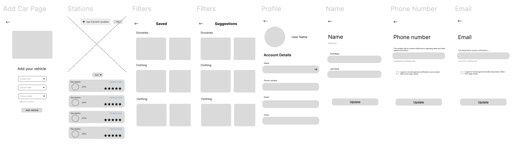
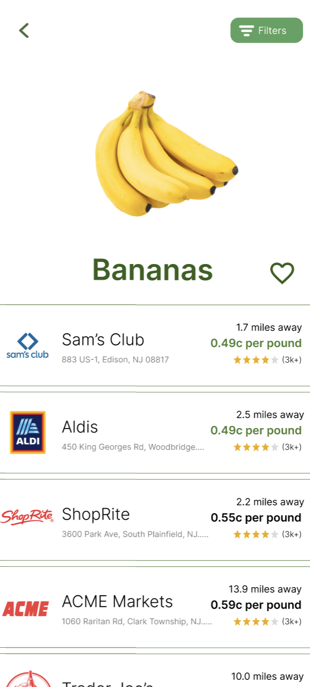
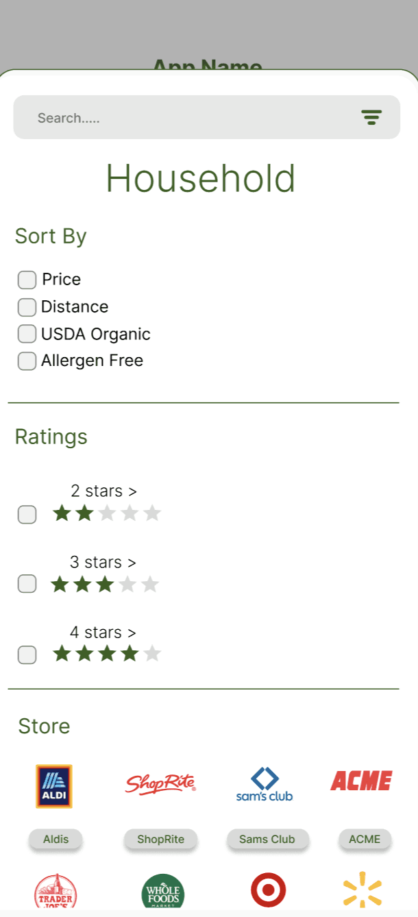
Specific Filters
We wanted to ensure that the user is able to compare products based off their specific needs. Every category has specific filters so the user gets the cheapest product while accounting for their personal preferences.
Specific Filters
We wanted to ensure that the user is able to compare products based off their specific needs. Every category has specific filters so the user gets the cheapest product while accounting for their personal preferences.
Specific Filters
We wanted to ensure that the user is able to compare products based off their specific needs. Every category has specific filters so the user gets the cheapest product while accounting for their personal preferences.

Specific Filters
We wanted to ensure that the user is able to compare products based off their specific needs. Every category has specific filters so the user gets the cheapest product while accounting for their personal preferences.


Simplification of Nav Bar
We decided to simplify the top panel and move the filters to the bottom of the screen. The reasoning behind this change was to make everything more simple and neat. Location is still on the nav bar.
Map View
Interactive map that shows all gas stations in your area. These are color coded so that users are able to see what the cheapest and most expensive option. A list option is also available if users prefer that method over the latter.
Map View
Interactive map that shows all gas stations in your area. These are color coded so that users are able to see what the cheapest and most expensive option. A list option is also available if users prefer that method over the latter.
Map View
Interactive map that shows all gas stations in your area. These are color coded so that users are able to see what the cheapest and most expensive option. A list option is also available if users prefer that method over the latter.
Simplification of Nav Bar
We decided to simplify the top panel and move the filters to the bottom of the screen. The reasoning behind this change was to make everything more simple and neat. Location is still on the nav bar.
Personalized Saved
Want to track certain products? Cargo allows you to track prices and organizes them by category in a singular saved page. The user will also be notified if prices go down on a certain product they have saved.

Personalized Saved
Want to track certain products? Cargo allows you to track prices and organizes them by category in a singular saved page. The user will also be notified if prices go down on a certain product they have saved.
Personalized Saved
Want to track certain products? Cargo allows you to track prices and organizes them by category in a singular saved page. The user will also be notified if prices go down on a certain product they have saved.
Research
Research
Survey Analysis
Survey Analysis
Insights
Insights
Survey insights
Competitor Analysis
Ideation
Ideation
Low-Fidelity Wireframes
Low-Fidelity Wireframes
Low-Fidelity Wireframes
"Design System"
"Design System"
"Design System"
Font Style Inter
Font Style Inter
Font Style Inter
High Fidelity WireFrames
High Fidelity WireFrames
We were tasked with coming up with an app idea in a week timeframe. A lot of good ideas were thrown around but we had trouble coming up with something both unique, and needed. Our main question was what app could have the most positive impact on the largest amount of people? During this brainstorming phase we discussed what problems many people share and spending was something that came up frequently. Food prices alone have climbed 31% in 6 years (nerdwallet) . We then used that idea to start the basis of the app.
Defining the problem: Users don't have a simple way to price compare and the current available price comparison methods usually don't account for the diverse preferences the population may have.
Background: We were tasked with coming up with an app idea in a week timeframe. A lot of good ideas were thrown around but we had trouble coming up with something both unique, and needed. Our main question was what app could have the most positive impact on the largest amount of people? During this brainstorming phase we discussed what problems many people share and spending was something that came up frequently. Food prices alone have climbed 31% in 6 years (nerdwallet) . We then used that idea to develop the basis of the app.
Defining the problem: Users don't have a simple way to price compare and price comparisons usually don't account for the diverse preferences the population may have.
Majority of potential users don’t have a specific app they use to price compare.
An overwhelming majority of potential users care about saving.
Potential users also price compare before purchasing.
Majority of potential users don’t have a specific app they use to price compare.
An overwhelming majority of potential users care about saving.
Potential users also price compare before purchasing.
Majority of potential users don’t have a specific app they use to price compare.
An overwhelming majority of potential users care about saving.
Potential users also price compare before purchasing.
I filtered the survey data to see what other price comparison methods are used most frequently
I filtered the survey data to see what other price comparison methods are used most frequently
I filtered the survey data to see what other price comparison methods are used most frequently
Based on the survey data we were able to separate our ideas into three different groups. We wanted to focus on defying features that would differentiate our app from other major apps.
Based on the survey data we were able to separate our ideas into three different groups. We wanted to focus on defying features that would differentiate our app from other major apps.
Based on the survey data we were able to separate our ideas into three different groups. We wanted to focus on defying features that would differentiate our app from other major apps.
We produced some wire frames just to see roughly the design of the app. We wanted to make sure we hit most of the functionalities as some of the screens generalize.
We produced some wire frames just to see roughly the design of the app. We wanted to make sure we hit most of the functionalities as some of the screens generalize.
We produced some wire frames just to see roughly the design of the app. We wanted to make sure we hit most of the functionalities as some of the screens generalize.
I put design system in quotations because we didn't have time to come up with a more formal design system. Since some group members were new to both figma and designing we wanted to make the process as simple as possible. Focusing on the core concepts color scheme, font and typographic hierarchy.
I put design system in quotations because we didn't have time to come up with a more formal design system. Since some group members were new to both figma and designing we wanted to make the process as simple as possible. Focusing on the core concepts color scheme, font and typographic hierarchy.
I put design system in quotations because we didn't have time to come up with a more formal design system. Since some group members were new to both figma and designing we wanted to make the process as simple as possible. Focusing on the core concepts color scheme, font and typographic hierarchy.
We wanted to make sure there was clear consistency in the typography. Listed below are the the most common use cases for each font size and weight.
We wanted to make sure there was clear consistency in the typography. Listed below are the the most common use cases for each font size and weight.
We wanted to make sure there was clear consistency in the typography. Listed below are the the most common use cases for each font size and weight.

Price tracking
Rewards system
Privacy concerns
Doesn’t update coupons
Only online price comparison
Easy to use

Compares Gas Prices
Navigation on app
Rewards system
Customer reviews
Only focuses on gas
Depends on user input

Notifies you of deals
Customer reviews
Accurate data
Isn’t a price comparison app
Highlights paid advertisments
Barcode price comparsion
Deal notification
Versatile covers lots of retailers
Limited price comparison options for food
Depends on user input

Price tracking
Rewards system
Privacy concerns
Doesn’t update coupons
Only online price comparison
Easy to use
Compares Gas Prices
Navigation on app
Rewards system
Customer reviews
Only focuses on gas
Depends on user input
Notifies you of deals
Customer reviews
Accurate data
Isn’t a price comparison app
Highlights paid advertisments
Barcode price comparsion
Deal notification
Versatile covers lots of retailers
Limited price comparison options for food
Depends on user input


Color Scheme
Main Green
#56A25E
Text - Heading 1
#56A25E
Text - Heading 2
#000000
Text - paragraph
#808080
Text - sub heading
#365F1F
Buttons Green
#538536
Typography
h4
bold
Item names (general)
Profile information
h3
bold
paragraph small
regular
store description information
h2
Text sizes
General Uses
24
30
General font weight
Names of Pages..
bold
19
10
h1
36
paragraph regular
regular
Profile information and other small but important details.
16
Items (specific)
bold
R code available github.com/blackulous
R code available github.com/blackulous
R code available github.com/blackulous
Design Iterations
Design Iterations
Design Iterations
Highlights
Highlights
Highlights
Due to fact we had limited time and weren't able to conduct user testing our goal was to make the app design as simple as possible. The design changes below reflect that.
Due to fact we had limited time and weren't able to conduct user testing our goal was to make the app design as simple as possible. The design changes below reflect that.
Due to fact we had limited time and weren't able to conduct user testing our goal was to make the app design as simple as possible. The design changes below reflect that.


Final Thoughts
Color Scheme
Main Green
#56A25E
Text - Heading 1
#56A25E
Text - Heading 2
#000000
Buttons Green
#538536
Text - sub heading
#365F1F
Text - paragraph
#808080
Typography
Text sizes
General font weight
General Uses
h1
36
h3
h2
24
30
h4
19
paragraph regular
16
paragraph small
10
bold
bold
bold
bold
regular
regular
Items (specific)
Names of Pages..
Profile information
Item names (general)
Profile information and other small but important details.
store description information
High Fidelity WireFrames
Key takeaways
Key takeaways
Testing after each stage (if time permits)
Conducting testing after each stage so that we can make changes as we go. This allows us to really center the user and essentially take them with us each step of the way until the final product.
Testing after each stage (if time permits)
Conducting testing after each stage so that we can make changes as we go. This allows us to really center the user and essentially take them with us each step of the way until the final product.
Set specific goals for each team member
Assign clear goals to each member and not make tasks generally open-ended. Usually, if everyone is familiar with the software it is easier to do this. Since some group members were using Figma for the first time it was harder to set tasks properly.
Set specific goals for each team member
Assign clear goals to each member and not make tasks generally open-ended. Usually, if everyone is familiar with the software it is easier to do this. Since some group members were using Figma for the first time it was harder to set tasks properly.
Reflections
Time Restraints and Team Experience
We only had around 2 months to work on this app from research to presentation.
Some members weren't familar with Figma in the group so we had to slow things down to make sure everyone was able to understand what was going on.
Time Restraints and Team Experience
We only had around 2 months to work on this app from research to presentation.
Some members weren't familar with Figma in the group so we had to slow things down to make sure everyone was able to understand what was going on.

Reflections
Final Thoughts
Key takeaways
Testing after each stage (if time permits)
Conducting testing after each stage so that we can make changes as we go. This allows us to really center the user and essentially take them with us each step of the way until the final product.
Set specific goals for each team member
Assign clear goals to each member and not make tasks generally open-ended. Usually, if everyone is familiar with the software it is easier to do this. Since some group members were using Figma for the first time it was harder to set tasks properly.
Time Restraints and Team Experience
We only had around 2 months to work on this app from research to presentation.
Some members weren't familiar with Figma in the group so we had to slow things down to make sure everyone was able to understand what was going on.
Reflections
Customer reviews
Accurate data
Isn’t a price comparison app
Doesn’t notify you of deals
Focuses on paid advertisments
Barcode price comparsion
Deal notification
Versatile covers lots of retailers
Limited price comparison options for food
Depends on user input
Competitor Analysis
Simplification of Nav Bar
We decided to simplify the top panel and move the filters to the bottom of the screen. The reasoning behind this change was to make everything more simple and neat. Location is still on the nav bar.
Specific Filters
We wanted to ensure that the user is able to compare products based off their specific needs. Every category has specific filters so the user gets the cheapest product while accounting for their personal preferences.